© 2026 Start Point | All rights reserved

A project package or hour credits. A presentation and 2 revision rounds on every delivery.
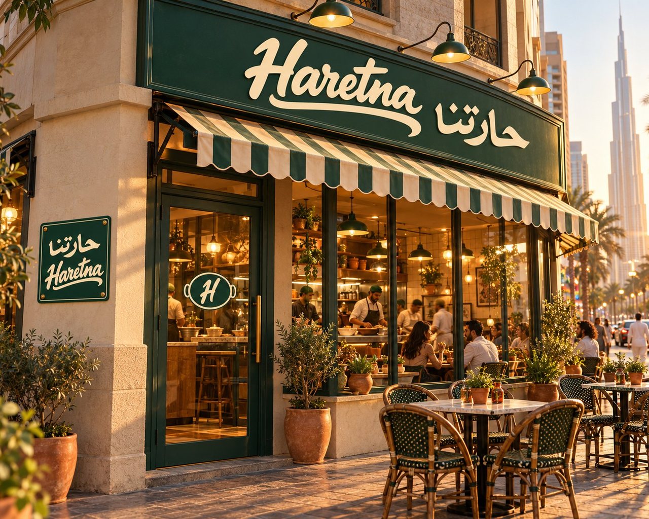
A neighbourhood, not a dish: the Haretna brand from the first brief to a bilingual website built to take orders.
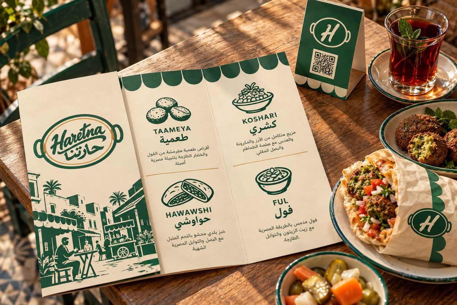
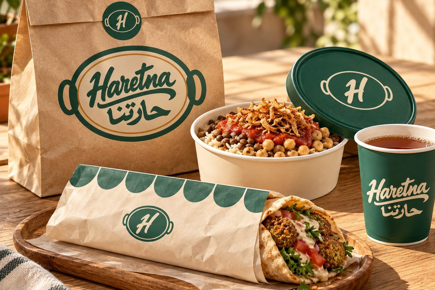
Haretna brings a corner of a Cairo street to the UAE: taameya, koshari, hawawshi and ful, generous portions, a neighbour's welcome. The idea in three words: Everyone's a neighbour.
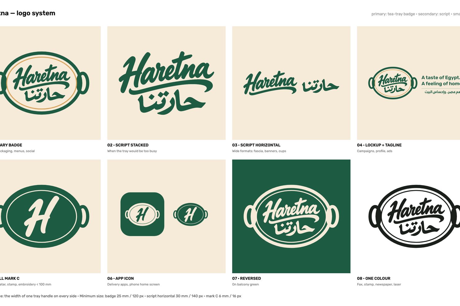
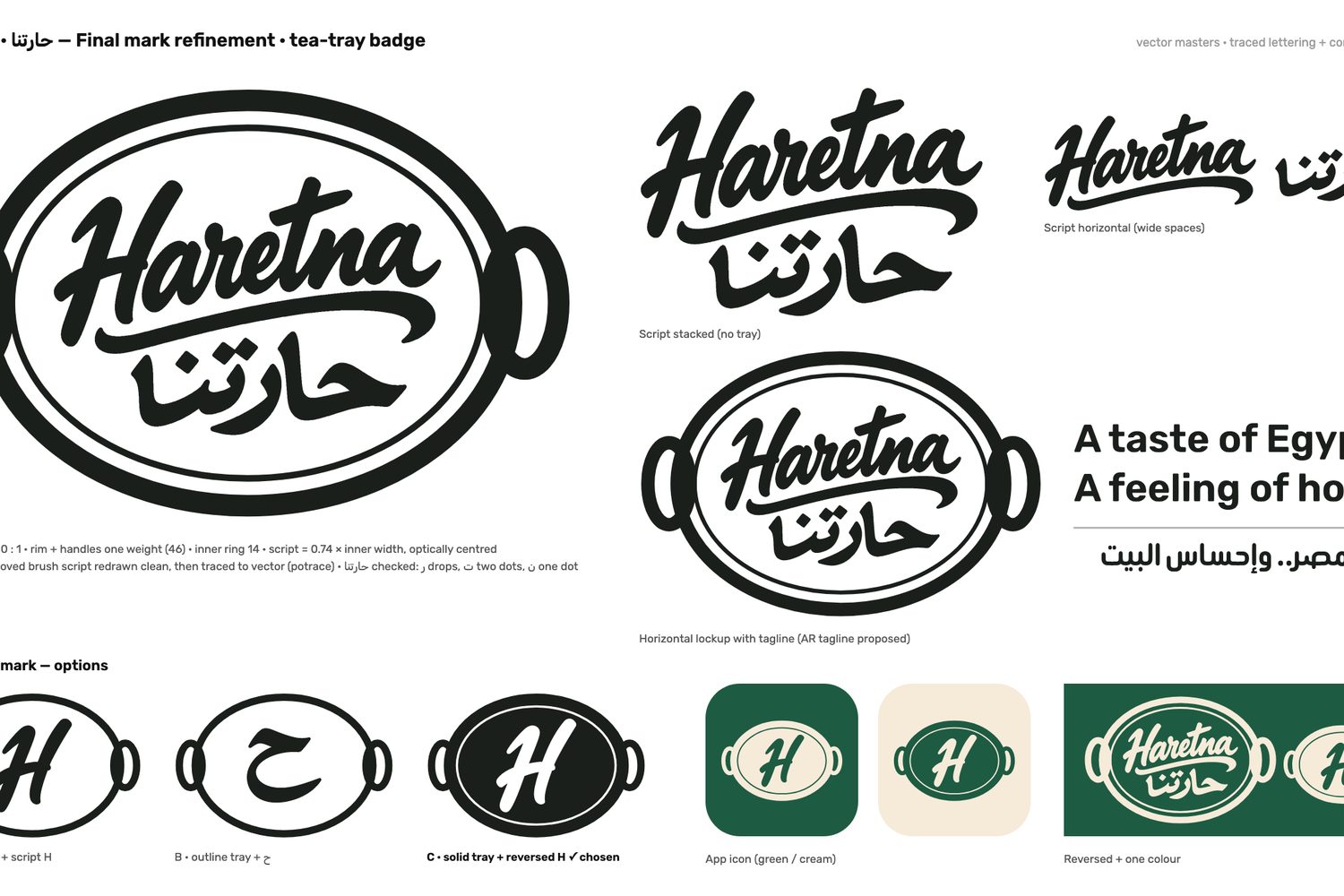
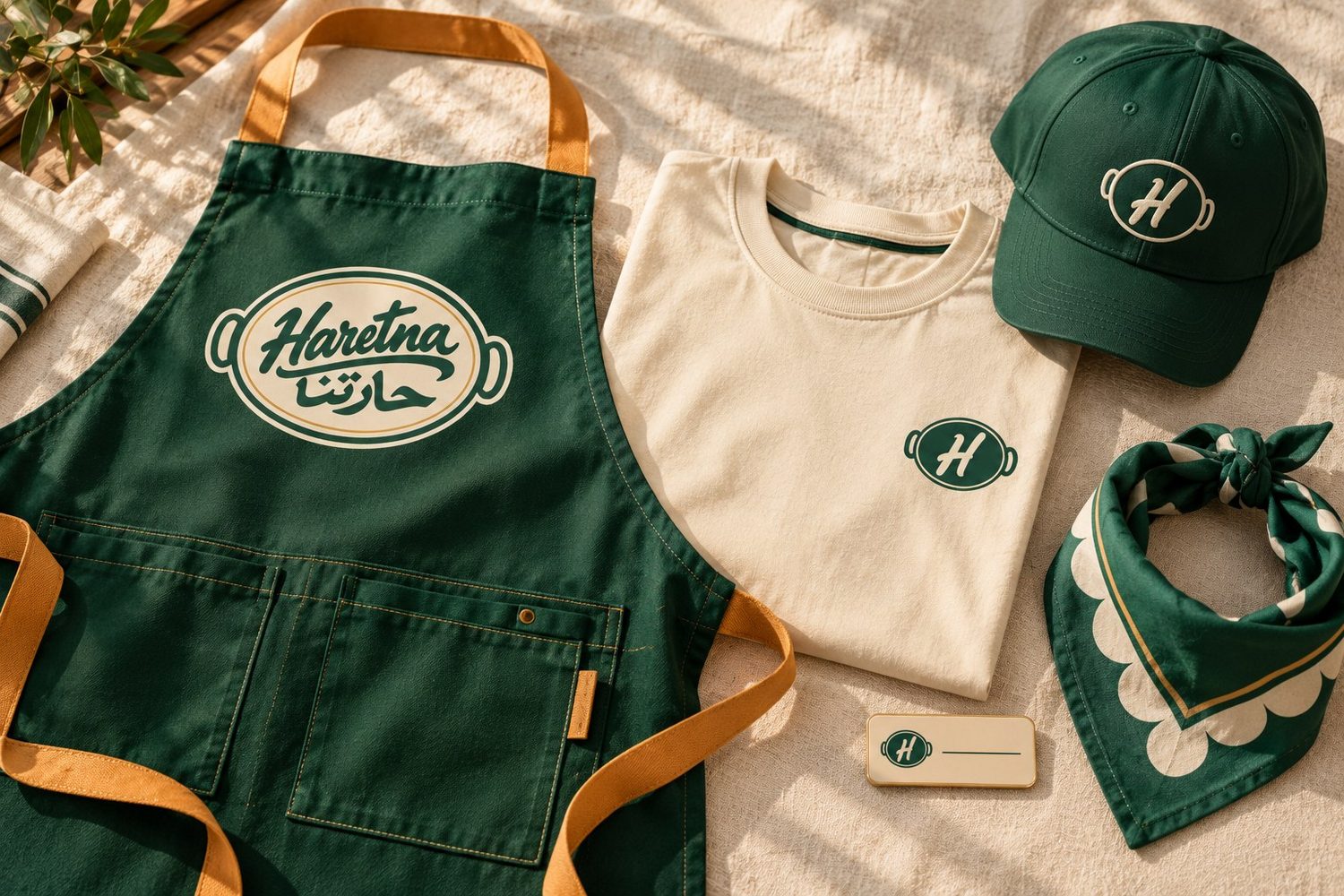
Brush-script lettering in Arabic and English, a tea-tray badge as the main mark, balcony green with tahini cream and a touch of dakka red. 38 logo files, a 41-page bilingual guideline, and a company profile as a deck and an A4 document.
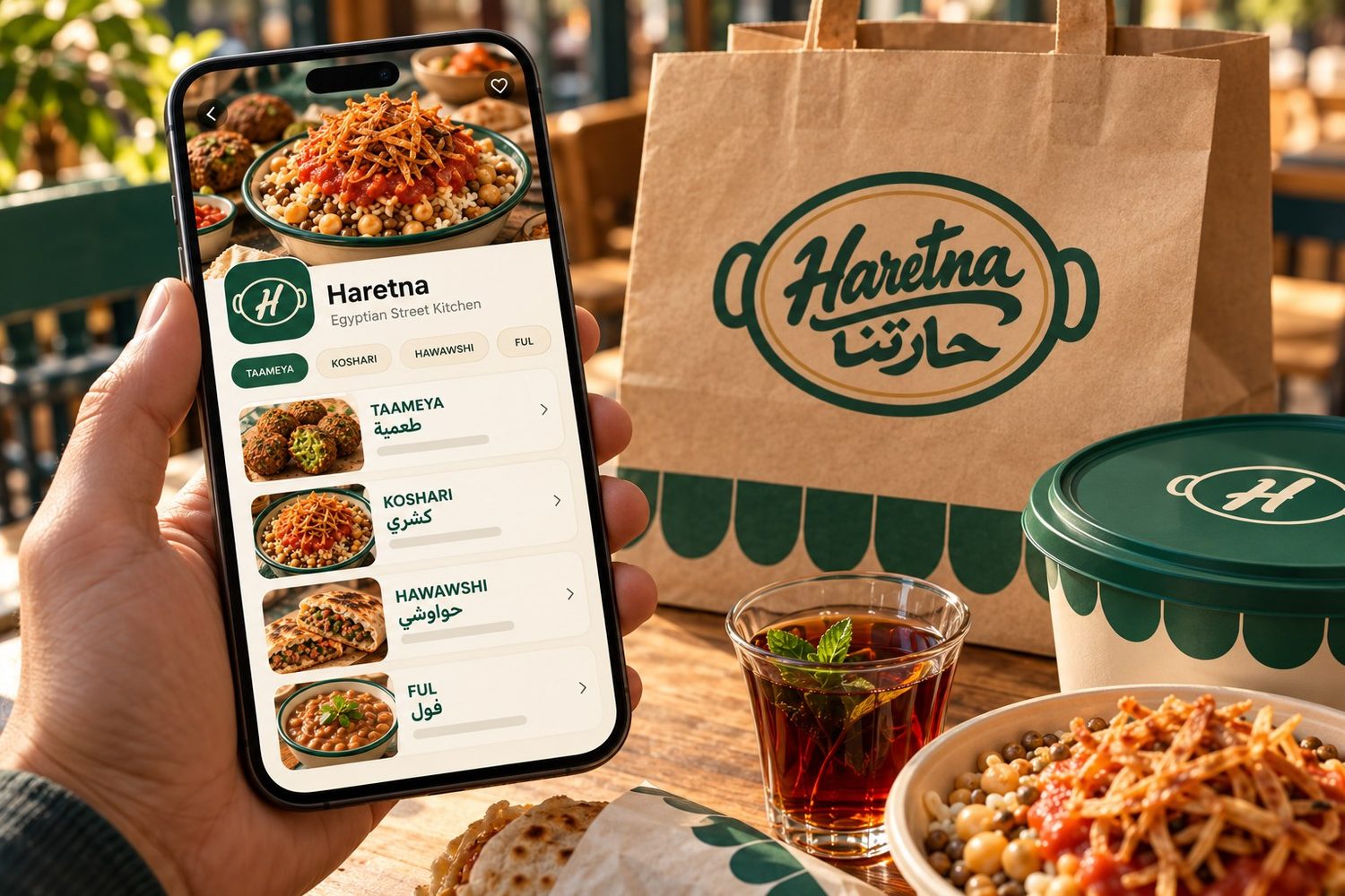
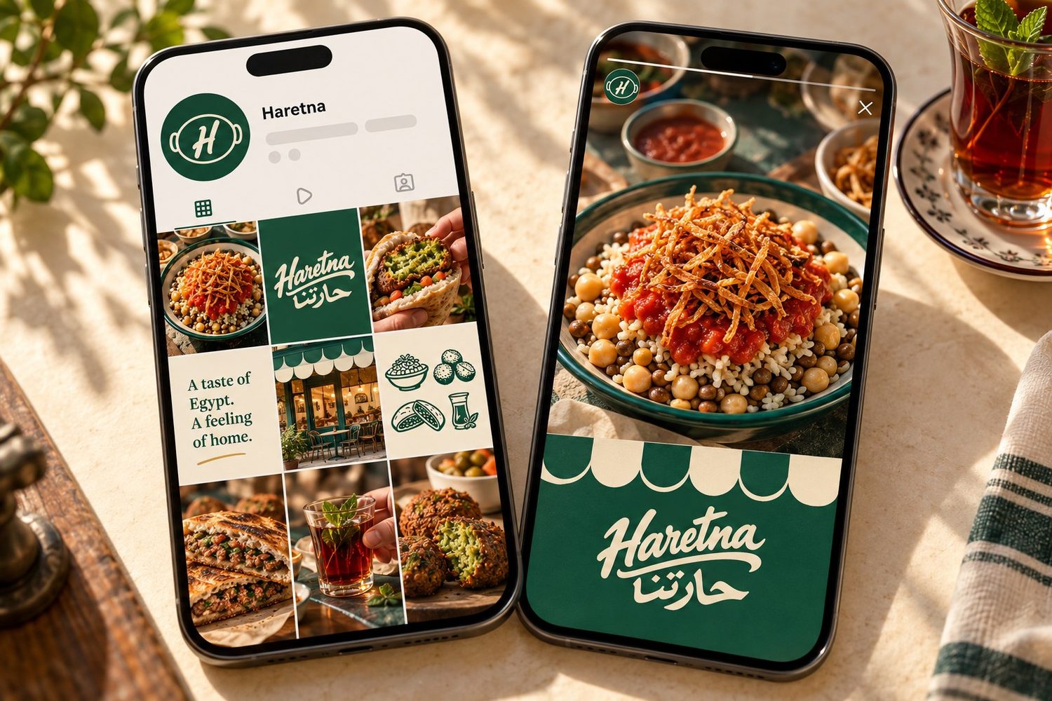
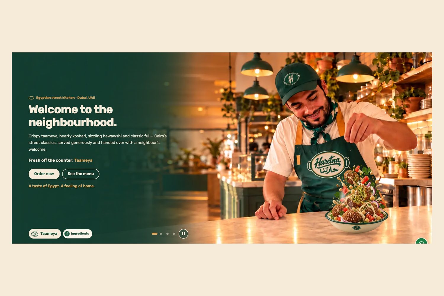
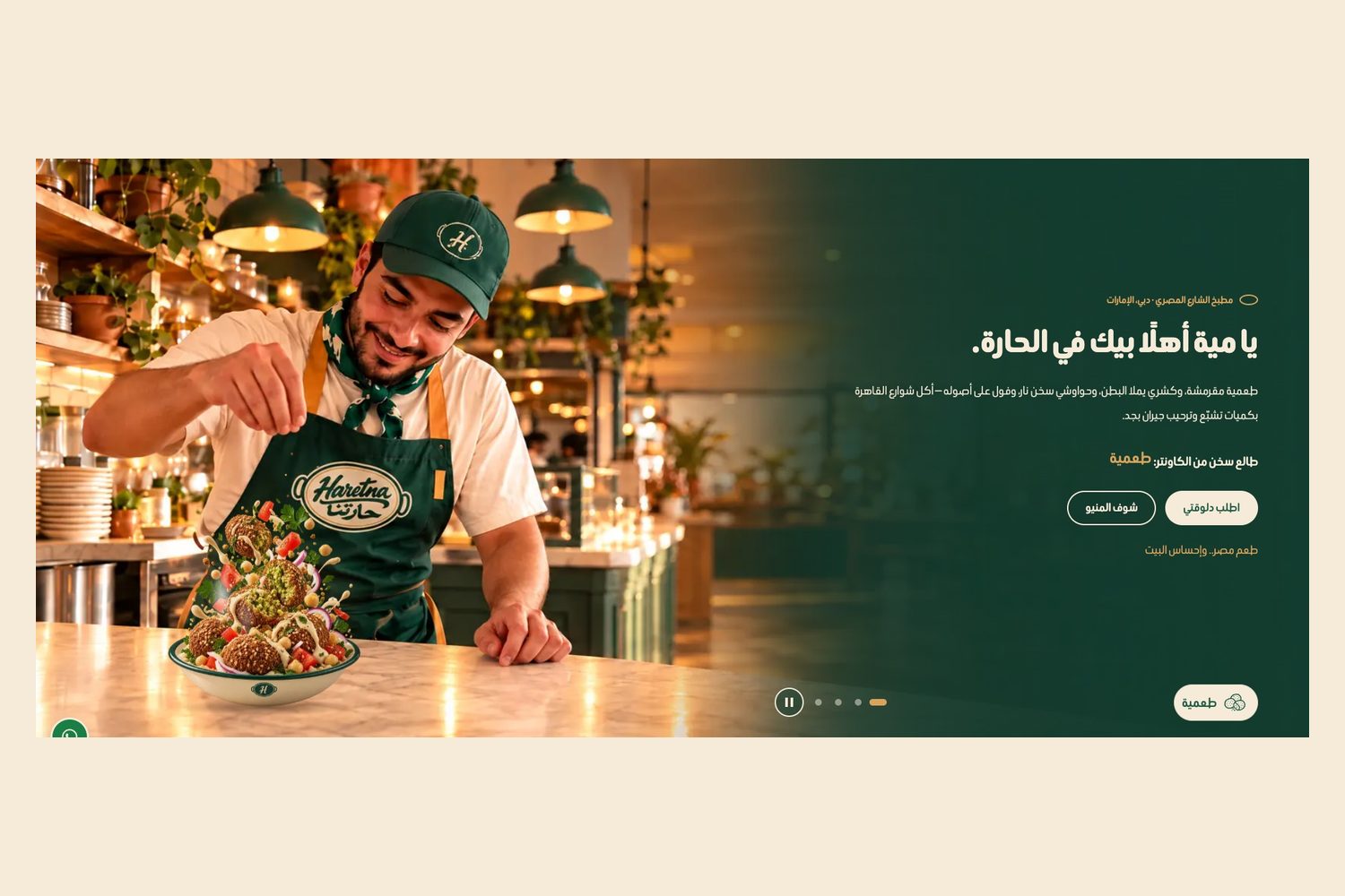
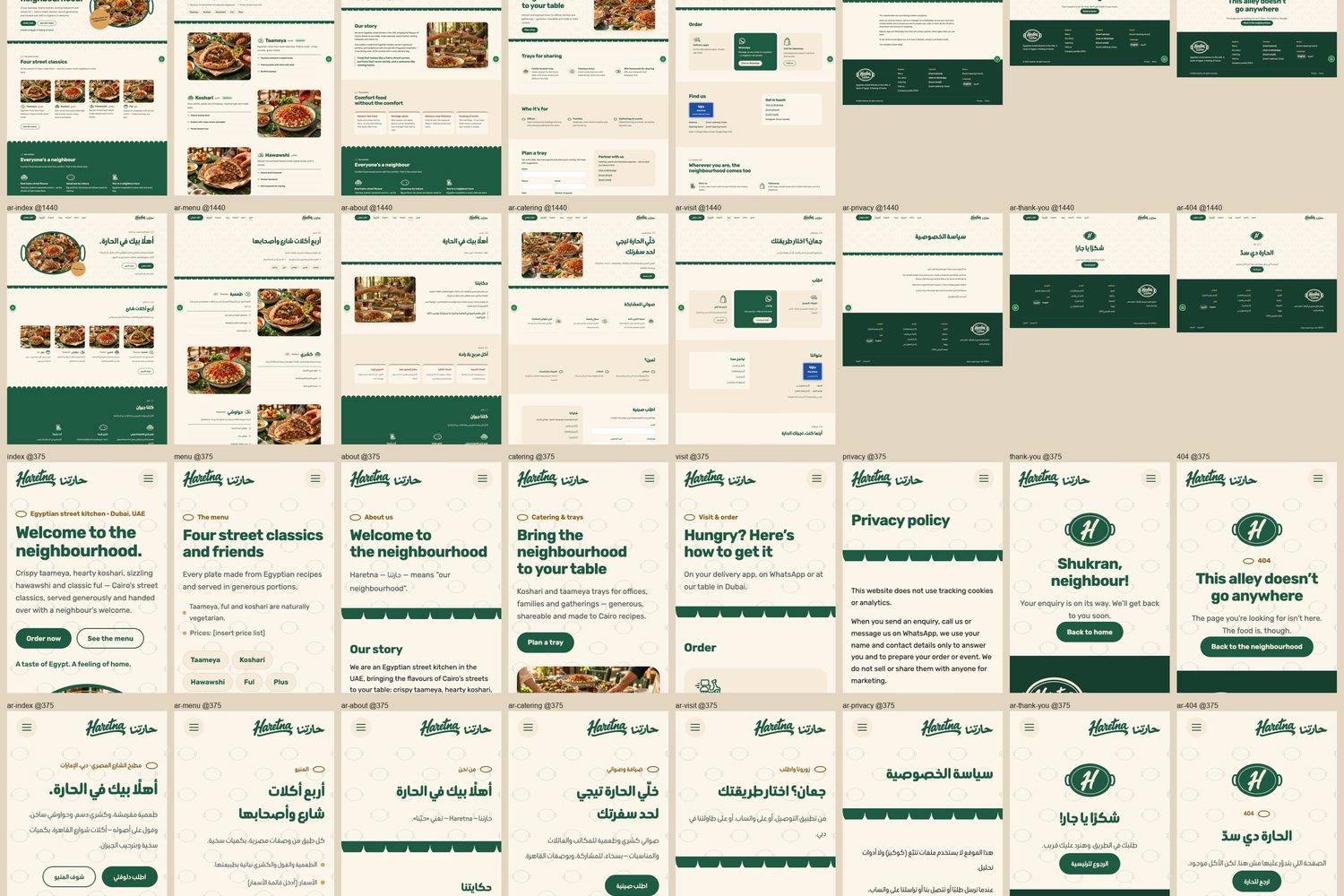
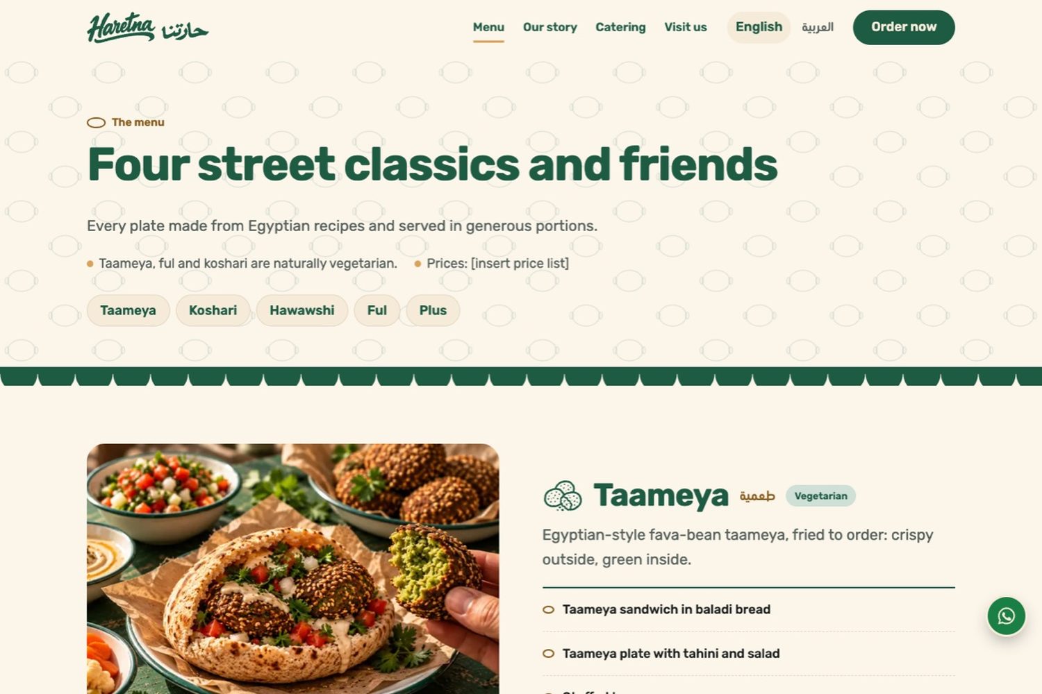
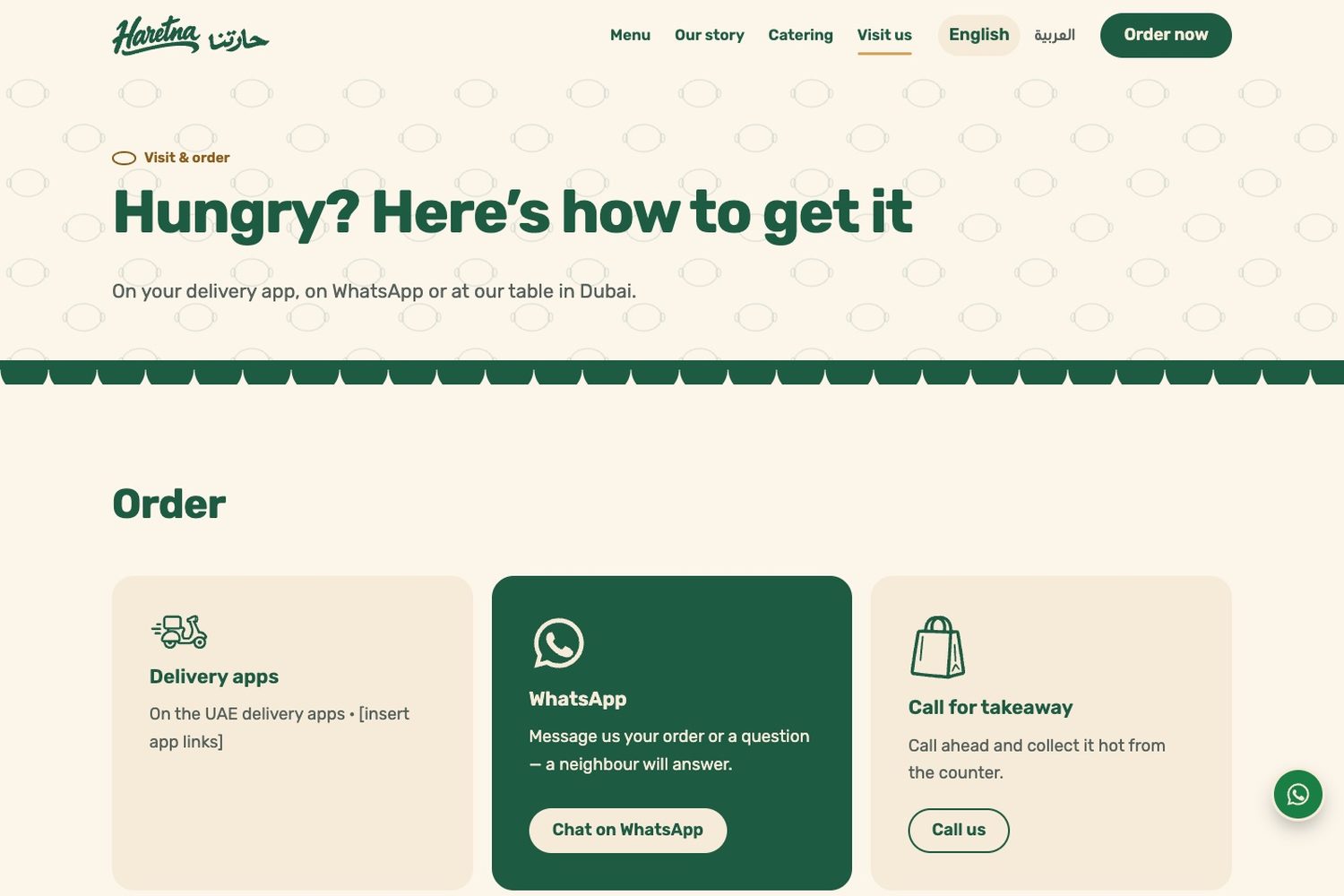
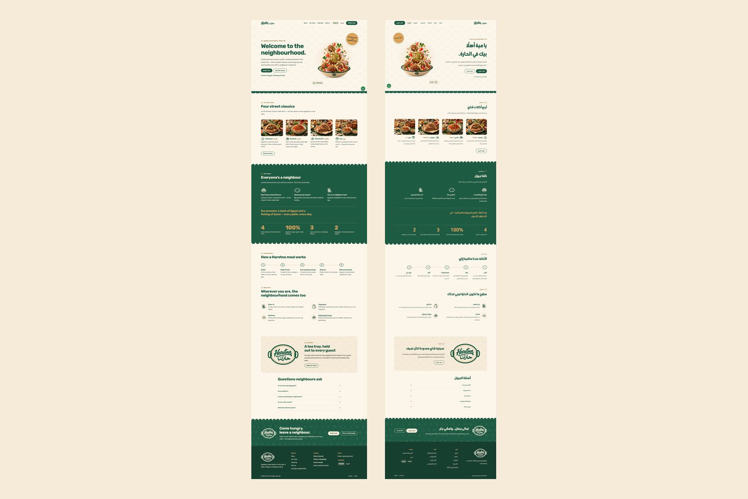
Five pages in English and Arabic: Home, Menu, Our story, Catering and Visit & order. One job for the site: Order now, through delivery apps, WhatsApp or a call. A dish slideshow in the hero, awning scallops between sections, and the brand's green on every button.
Start your project Next project: Daftario — Identity, App and School System